5… 4… 3… 2… are necessary stages, but at T minus 1 it’s a GO and there’s no turning back
T minus 1 is the moment before — before your brand launches, your campaign delivers, or before your big presentation.
How do you want to feel at that moment?
We design creative, but we deliver confidence, so you can look forward to that moment instead of sweating it.
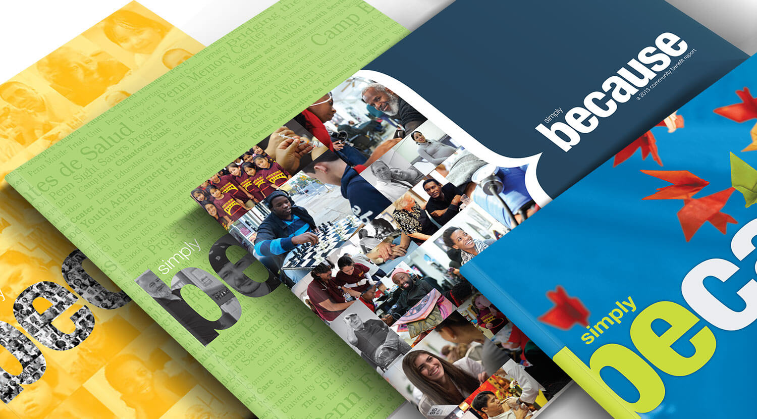
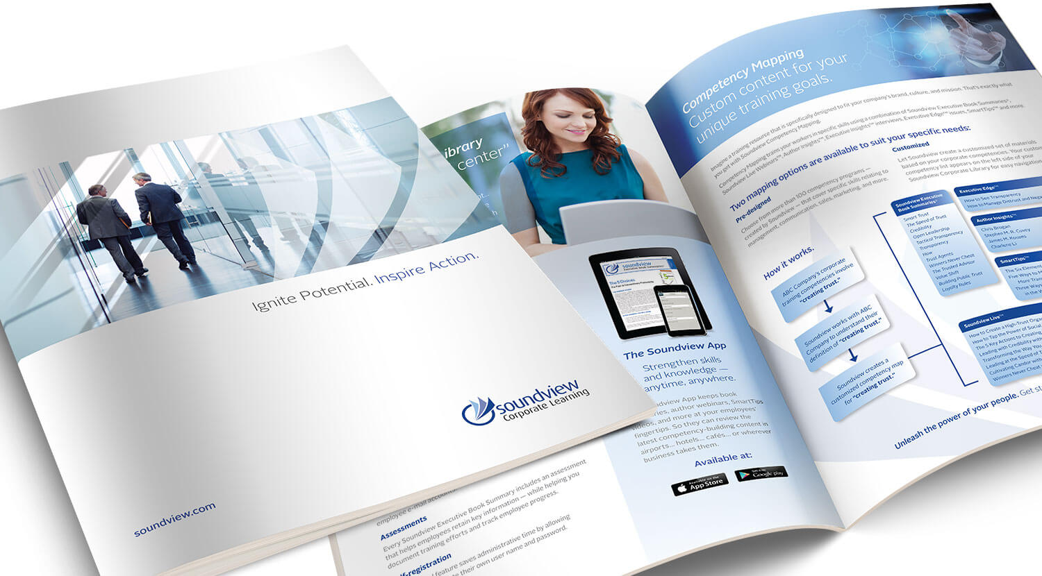
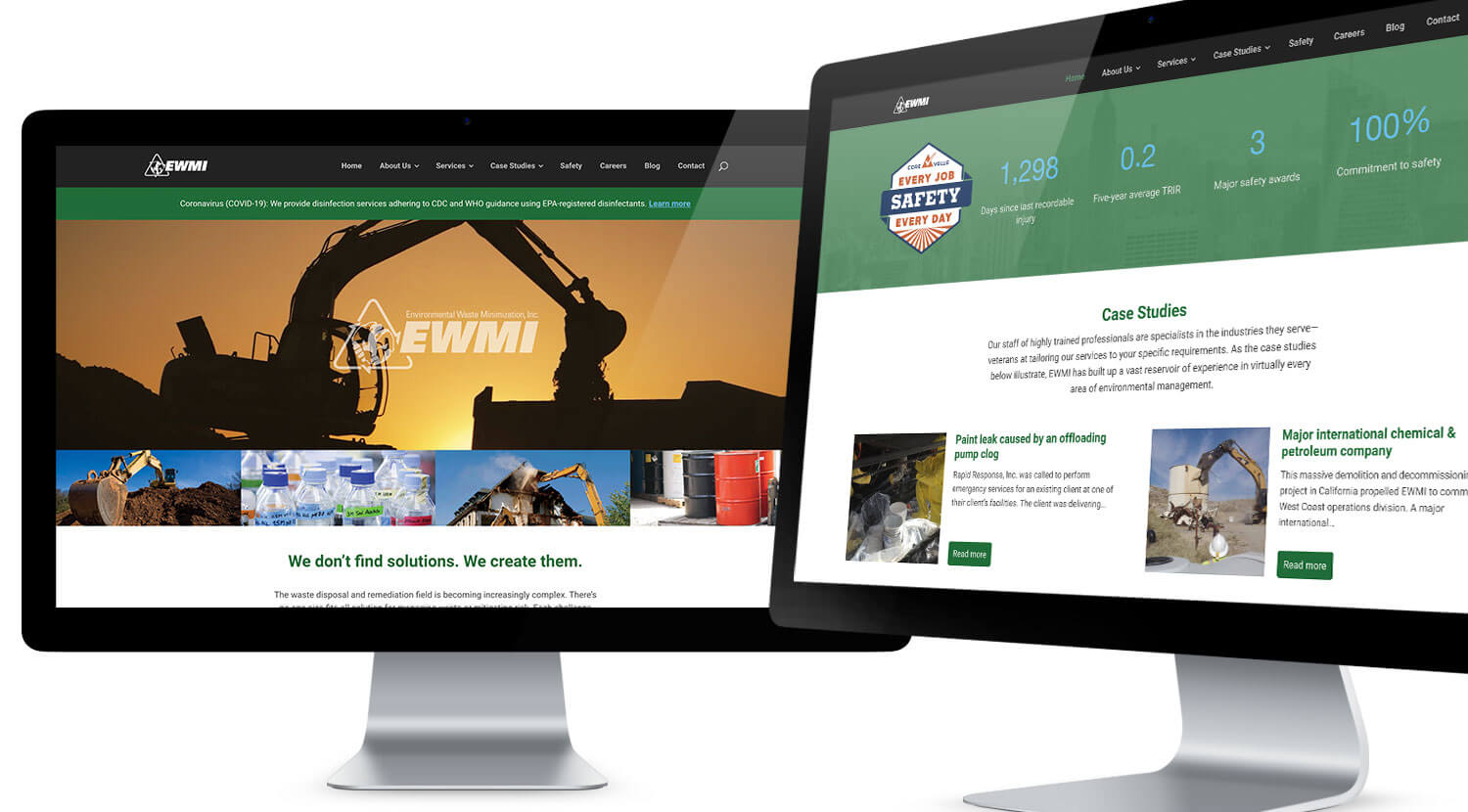
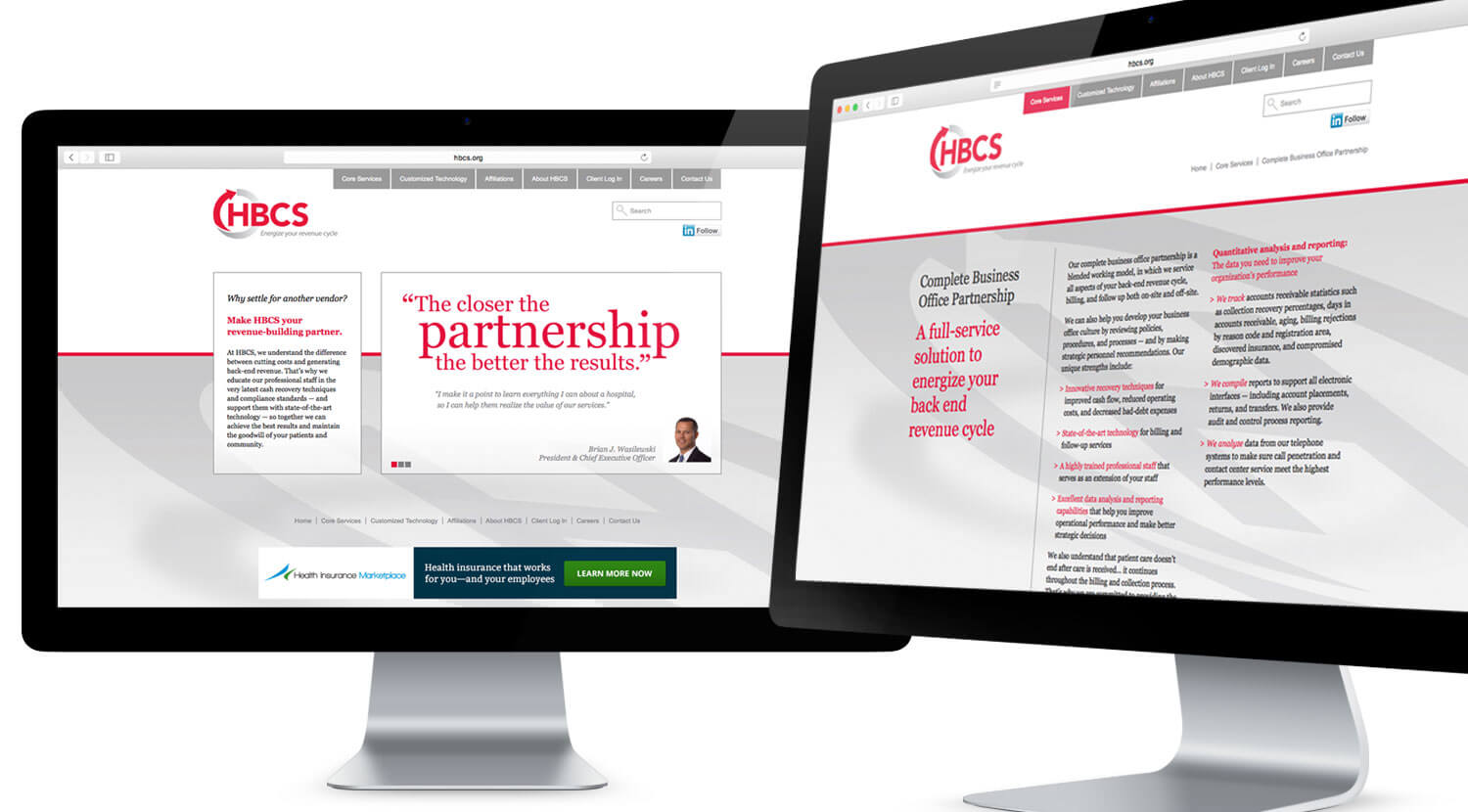
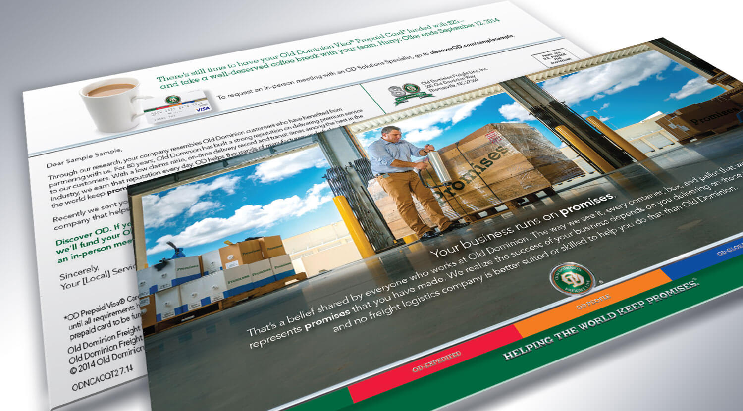
We specialize in supporting marketing professionals and corporate clients. Our attention to branding, collateral, and direct response disciplines consistently produces hard-working materials.
Tminus1 can be many things to many clients. For some we are a full-service agency… others a creative partner… others a project-based resource. Our size and structure allow us to be flexible and nimble.
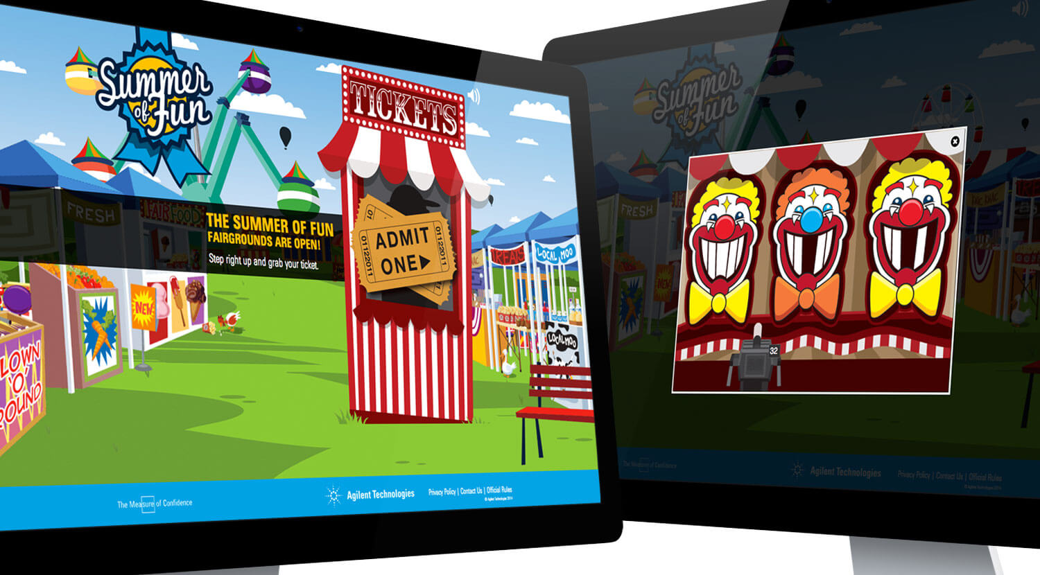
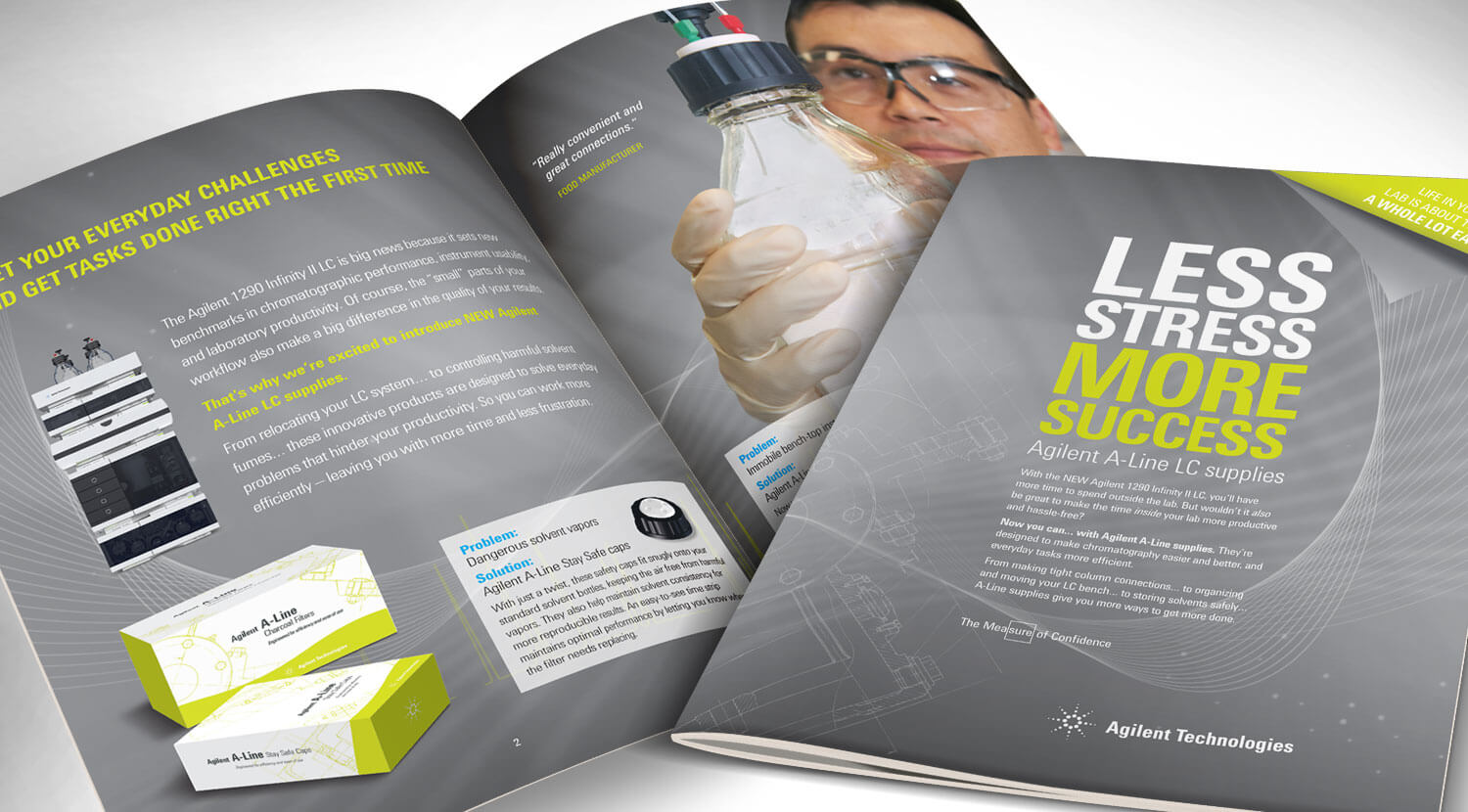
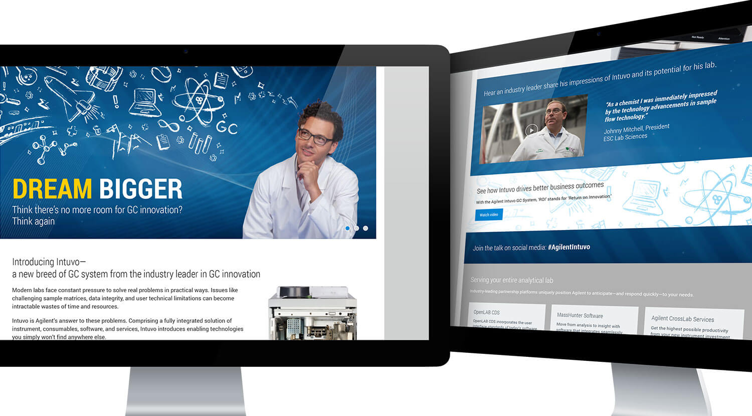
Print, direct response, collateral/literature, or e‑communications, Tminus1 Creative knows how to deliver. On the occasion when we don’t, we figure it out and we make it happen.
We love saving the day. We love making you look good. We love finding a way when it was thought there was no way. You could call it solution focused or work pride. We call it “every day.”
Consulting to concept to creation and deployment, we can handle any, or all, aspects of your marketing endeavours.
Design is a funny word. Some people think design means how it looks. But of course, if you dig deeper, it’s really how it works.
Steve Jobs, Apple, Inc.
Here are some projects that we are particularly fond of.
The EWMI/RRI stationery has to work twice as hard with two companies under one roof. After designing each logo, we found that the stationery system needed a neutral color to tie the companies together. Gray did the trick and it worked as a single imprint color for employee business cards.
Since 2007, this community benefit report has been an agency favorite. What could be better than creating a coffee-table style book with gorgeous on-location photography and the most heartfelt stories each year? The creative award competitions have been kind to us over the years, too.
In the customer-vacationing days of summer, Agilent Technologies takes a break from promoting scientific instruments and supplies by giving customers a “Summer of Fun” game. Each summer, the game theme is different and prizes include gifts or discounts.
Located on the edge of Philadelphia’s suburbs, Honeybrook, PA is at the crossroads of Amish farmsteads, affluent Chester Springs, and everything in between. When asked to design their first can labels, we knew it wasn’t about the brewery's story. It was the area’s culture that differentiated Suburban Brewing. Starting with with design cues from Amish hex signs and bohemian mandalas, we created a design system that can accommodate as many labels as the brewery could devise brews.
In the tiniest nutshell, Soundview creates 8-page summaries of leading business books and delivers them via subscription. What they really do for an executive is ignite potential and inspire action. So we redesigned their brochure to say just that… and tied customer benefits to all of their product offerings.
As a continually growing environmental management company, EWMI’s web presence also needed to grow to incorporate their new services, new content, and expand their footprint for search engines. Tminus1 blew out their single-page website to multiple pages giving search engines more to crawl and potential customers more insight into their offerings. We also added a blog, which EWMI maintains, enabling them to create more content to cross-link through the site and social media.
A full-color magazine insert was a great way to showcase Agilent’s new product line complete with new product packaging. The multi-page insert was later converted into a brochure.
These icons were created to help differentiate industries in Agilent’s segment marketing tactics. The visual identifiers give a quick connection for the scientists and their segments of work.
When launching a new category of product—something the market has not seen before—the promotional landing page carries a lot of information. Organization and message flow was key here to capture attention and then guide the reader through the numerous game-changing innovations that Intuvo contains.
Although HBCS works with payments, they are not a bank. They coordinate with medical insurances, but they are not an insurance company. Their clients are hospitals, but they themselves are not in the medical industry. So we used an all-typography style on their website to avoid potentially misleading viewers with industry photography. The result is a crisp, clean and credible site.
At the time, Black Walnut was just a fledgling winery with a modest budget. However, they still needed a business card with depth—like their wine. Colored paper stock and the use of three printing inks provided great tonal range while keeping the job in budget.
This pocket folder for EWMI is used to hold sales sheets for their marketing team, proposals for their sales department, or on-the-job documents for the field crews. It looks equally good on a desk or at a job site.
In shipping logistics, time, space, and procedures are everything and errors cost money. This undisclosed freight company needed a tool to help educate customers on common shipping errors in a fun, friendly way. This online game uses visuals, sounds and trivia to create awareness about potential problems that customers can avoid to improve their shipments.
Promotional landing pages for scientific instruments can quickly get bogged down with technical information. Our challenge is to organize it and present it in a way that delivers the marketing message while providing access to technical details.
Holding a scientist’s attention can be a tricky task. This trade show promo item places Aglient’s message in an ever-unfolding block. But this is not just a toy, it also has a small USB drive that slides out.
In the heart of the majestic Blue Ridge Mountains is Gateway Mountain, a private residential commmunity. This ad series focused on just one of the amazing amenities that the properties offer — the views.
Brewphoria is a brand created for Canal Street Restaurant and Bar's craft beer event. Each year, dozens of brewers bring their finest offerings for a night of beer tasting, music and food.
Sometimes clean graphics and small animations are all that is needed to guide the reader through features and benefits on the landing page.
Black Walnut is very creative with their wines, and that means a need for a bottle label design system that gives the varietals individuality while not straying from Black Walnut’s brand.
This freight logistics company realizes that when businesses ship, they are giving a promise. Old Dominon makes sure that promise is delivered. Postcards, selfmailers, emails, landing pages and an online game, are all part of campaigns we have helped develop.
This unique-looking van that is taller than it is wide is called a Sprinter. Freightliner wanted to point out that size was not the only difference in owning this van. So we created a self-mailer that included a personalized letter, brochure copy and a slide rule showing head-to-head comparisons with the competition on fuel and maintenance costs at different mile segments. And the whole thing was printed on one sheet of paper.
This flexible format was created for Huntington Bank. It's personlized with name, address and promo code. The card is an easy-tear-off action device to get prospects into the branch, but a PURL is also supplied for online access to the promotion.
Tminus1 has gained experience by completing work for a large, diverse and growing list of companies either directly or with our agency partners. This cross-industry experience provides a broader vision while developing client solutions. Here are just a few of them.
Need an introduction? Have an immediate project? Just plain curious?
We’re anxious to hear from you and we’ll be quick to respond!